Friday 23 December 2016

Risk Assessment

I have carried out a risk assessment of the locations where I will be taking my images for my music magazine. 

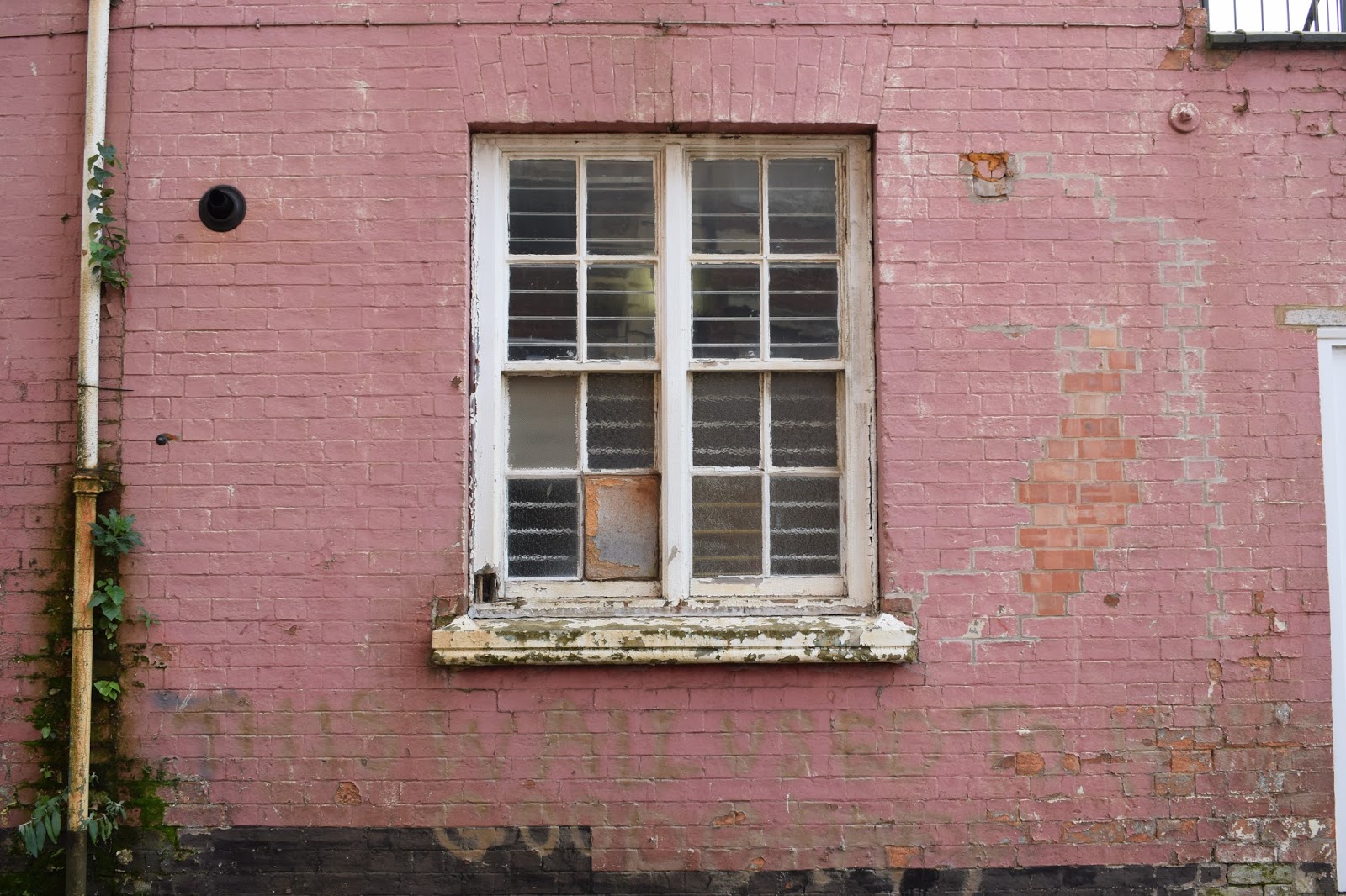
The location of the pink wall was next to a road which was a dead end, therefore, this may be a risk as many cars use this road throughout the day. Although this location was a quiet area and therefore there were not a lot of people of whom walked on the pathway where the model would be placed.
                                                                     
The park:
Risks consist of the location being wet and therefore become slippery. The model or the photographer may get hurt in this situation.


The location of the factory also had the risk of being in the way of other people or the danger or cars as it was a very busy road.
Brick wall:
The brick wall was in an isolated area where there was no risk of cars or other people although the only risk was that the part of the bottom of the wall that was overgrown and the model could trip or if it was wet the model would be at risk of slipping.

Factory door:
This held the risk of vans needing access through this door and the risk of the model being harmed by these cars.


The boarded up pub/club was also in the same area as that of the pink wall; therefore, there was the same risks of cars and people.


The next location of the plain black wall was in a residential car park; therefore, there was a large risk of cars injuring myself or the model during the photoshoot.


The precautions I will take concerning whether it rains on the day of the photoshoot is to change the location to an indoor alternative or arrange another time for the images to be taken. The risk of the cars will be dealt with by assessing how busy the area is and ensuring that not many cars are around; if it is busy then I will ensure the model and myself are not in the way of these cars and are in the safest position.

Tuesday 20 December 2016

Original Images Analysis


The first few images were taken within a local park, I choose this location and had my model stand in the middle of the pathway to introduce symmetry into my images. The model is holding a guitar to convey that it is a music magazine and to further convey that they are an artist.
In the first four images on the left the model is looking at the guitar and moving naturally between images as if she is playing the instrument. The first three images are mid-close up images, by doing this there is still obvious symmetry, you can see the model clearly and there is not a lot of focus on the busy background as the location was in the middle of a built up area.
Within other images I zoomed out from the mid-close up to create a wide shot to emphasise the symmetry of the trees and the amount of space around the model/artist. I then continued to use this wide-shot angle/frame as I wanted to take a variety of shots and by having some images more zoomed out I have the choice to crop the image to fit the magazine whilst editing my chosen images.

In other images, the model/artist turns her head more towards the camera although there is not direct address from the model within these images. I took these as action shots to imply within my magazine the natural state of these artists performing or busking as they may have before they succeeded in their career. Therefore, this further places emphasis on my indie-pop genre as music related to this genre are quite acoustic and in a way by taking images in a natural setting, along with the guitar and everyday clothing I am able to convey my artists like the genre, back to basics and raw.

I then changed my technique by taking the picture portrait to further provide myself with a variety of images to ensure I have an alternative set of images in case one of the previous landscape images cannot be edited to fit my magazine's design. Although, within this portrait images the model/artist does begin to create direct eye-contact which therefore establishes a direct mode of address and personal connection with the readers/audience. I then took my images so they were landscape again; although I zoomed in a bit more to get a mid close-up shot where the artist/model is making direct eye contact. At this point within the photo shoot the model changed the position of her head and angles it more upwards and clearly shows her face along with direct eye contact.

I then changed to my next location; the park bench is representative of the artists relaxed, raw music style as it is very simplistic and can be described as a natural image as the artist is implied to have started off busking in her local areas and performing in the local bars etc.
I then changed the shot by zooming out to the long-mid shot so that this yellow, fallen post that conveys a rustic, abandoned tone to the images which is common within indie-style images.

After taking more images on the bench with close-up shots of the model/artist I then changed my location to a tree within the park; to place more emphasis on the season of autumn I attempted to include more leaves into the images although in my original image post you can see that these images were not successful and therefore I decided to have the model sit on the floor and have the model as the main focus although obvious use in the background of the autumn leaves. I then used a variety of shots within this setting of mid-shots and close-ups to create a wider variety.
The next location I used the similar techniques of using a wide range of shots against a black wall; the black wall gave my images a very simplistic look and therefore placed all the focus onto the artist/model.
There is very similar reasoning for the next four locations as they were all quite simplistic and were not very busy background and therefore would place further emphasis on the model.

Monday 5 December 2016

RECCE

Possible locations for my photos:


These first three locations are all within the same location. This possible location is a public park which would give a rural, raw look to my indie-pop magazine. Many other indie magazines I have analysed incorporate nature within their images therefore, I may use this location to introduce the indie genre into my magazine although these locations don't convey the pop genre alongside the indie. Therefore, to make the genre of my magazine more obvious I would have to incorporate images set in other locations to
convey the overall indie-pop genre.


I choose this factory as the next possible location as the rustic look furthered conveyed the indie genre although, not as strongly as the previous setting therefore, this location incorporates more of the indie-pop genre.
This factory conveyed a rustic, abandoned theme which I believe suits the indie genre well as indie music magazines are usually reflective of the raw and independent artists of whom are consumed by the pop industry. As my music magazine is the indie-pop genre I am able to focus on either the aspects of indie or pop within each magazine edition. Therefore, by having locations such as this factory I am able to focus on the indie side of my genre within the image and then add pop conventions within the editing and incorporation of text later within my development.


Within the same location there was a large green garage door which I thought also withheld good conventions of the indie genre.


My next location was a large segment of black brick wall. I believe this is a good choice of location for my indie-pop magazine as many pop magazine's images contain very plain and simplistic backgrounds with the artist being the main subject/focus. Therefore, to incorporate both indie and pop equally I choose this plain background to contrast against the more busy locations such as the ones in the park.


For similar reasons as the brick wall above, I also found this other brick wall which was a lot more rustic and run down which conveys the indie-pop genre well. Many indie-pop artists started their career or their love for music when they were out busking in their local areas, with these sort of locations I am able to convey where the artist may have begun their career as an artist and in a way taken them back to basics.


The next location was also a brick was that was quite rustic although it was this eye-catching bright pink which would add a different aspect to my magazine images.


These windows provided a backdrop similar to the ones earlier at the abandoned looking factory although added more lighter, eye-catching aspects which I believe would appeal more to my target audience. Alongside the peeling paint on both the windows and the brick wall itself  can be seen as stereotypical indie-pop rustic conventions. This location would work well as a contrasting colour against the black brick wall as well as the plain, deteriorating brick wall.


Following on from the abandoned, rustic feel I used this abandoned, boarded up pub/bar. although this locations has some conventions of indie-pop, it is not what I was looking for and looks too pristine and new to convey the rustic look, therefore, I don't think I will be using this location for my images as I don't believe it carries the accurate conventions I desire for my magazine design.


Colour Consumers and The 50 Quid Bloke


Colour Consumers:

Yellow:
  • optimistic and youthful
  • often used to grab the attention of window shoppers
  • yellow is mostly associated with joy; yellow can then stimulate for the TA/reader mental activity and generate musical energy to make the reader feel more positive and energised
The use of yellow would be effective within my indie-pop music magazine design as my target audience consists of a youthful group which are attracted to the colour yellow. Yellow stands out well against a dark background and can be used to suggest the theme of nature alongside other colours of blue or green, and although my music magazine images are planned to be taken outside, there are no aspects of nature that I wish to incorporate within my magazine design as I believe it does not convey the indie-pop genre.

Red:
  • energy
  • increases heart rate
  • creates urgency
  • often seen in clearance sales
  • represents anger
  • lust/love/romance
Using red within my indie-pop magazine would be effective in the use of ads or an exclusive article as this bright, bold colour would stand out to a potential purchaser/reader of the magazine. It also stands out well against a darker background or a black and white image as well as it is not often you see a large use of red within a music magazine especially indie-pop as the brighter red may be more associated with a R&B magazine. Although a more subtle, light red shade would suit my magazine genre more effectively. Therefore, I may use it within my magazine although the image used alongside the text in this colour would have to be considered carefully as there are many different shades of reds/oranges within my images. Furthermore, the further use of red would be overly used and will not look appealing as I want my magazine to connote a sleek, professional look.
Blue:
  • creates the sensation of trust and security
  • often seen with banks and business
  • stability
  • associated with confidence, wisdom and intelligence
  • it can be viewed as calming as blue is the colour of the sky and sea; nature is seen to influence people in a calming way

The use of blue within my music magazine I believe will be ineffective; blue suggests a more serious and business orientated magazine and is therefore providing a sense of formality where as within my magazine I want it to be more informal. By not using blue, my magazine would appear more informal and therefore would appear more appealing to potential buyers within my target audience.

Green:
  • associated with wealth
  • the easiest colour for the eyes to process
  • used in stores to relax
  • symbolises fertility
  • green is associated with growth which is therefore connected to the connotation of nature
  • green could be used to create a sense of safety although, a dark green could be used to create a sense of wealth

The use of green within my music magazine would be incorporated through the setting of my main images rather than it being edited in through the text etc. Therefore, the only green I intend to use in my own music magazine is the green in my main images that is associated with nature.


Orange:
  • aggressive
  • creates a call to action: subscribe, buy or sell
  • orange can be used in place of red due to its less aggressive connotations
  • orange is often associated with joy, enthusiasm, creativity and success

The colour orange is a colour I have planned to use in my design of my music magazine as I am planning to have a very simplistic design that appeals to my target audience, the use of orange can be used as my images are based in an autumnal setting and therefore orange would blend in well. Although to increase continuity within my music magazine I will avoid using orange as although it creates a call to action I am not aiming to use it throughout the magazine.

Pink:

  • romantic and feminine
  • used to market products to women and young girls
  • pink is widely associated with stereotypical feminine connotations such as being sweet, nice, cute etc.  
I will incorporate a light, pastel shade of pink within my music magazine in co-operation with any white or black text; this adds to the simplicity of my music magazine through the colours used. By having a lighter shade of pink it isn't seen as feminine as a darker, brighter pink which therefore suggests the shade I will incorporate will be viewed as more gender neutral.

Black:

  • powerful and sleek
  • used to market luxury products
  • black would place a formal tone on a music magazine which should be used for more elegant magazines that are more advanced in musical knowledge; where as a colour like pink is more informal as it is usually used for pop genre music magazines targeted for children of whom enjoy the fun, simplistic side to their music
The use of black within my music magazine would be effective in that it incorporates a sleek, modern and luxurious look to my magazine. Indie magazines are stereotypically designed to be informal and raw looking, although as my music magazine is the genre of indie-pop a more sophisticated look can be incorporated due to the more formal, pop genre. Although the use of black alongside the light shade of pink would ensure that the magazine design is still incorporated as informal and therefore more audience focused.

Purple:
  • used to soothe and calm
  • often seen in beauty or anti-aging products
  • purple is often associated with luxury, ambition, extravagance and independence
I may also incorporate the use of purple within my music magazine because I believe that it would be applied well within my colour scheme of black, white and pale pinks.

Overall my colour scheme will consist of:


50 Quid Bloke

The "50 Quid Bloke" refers to a middle aged man of whom spends £50 every so often on items he doesn't really need such as CDs, DVDs, books etc. This type of individual enjoys these simplistic purchases and he is also a big fan of music as he has been for his whole life.


Thursday 1 December 2016

Creativity of My Music Magazine

Action Plan and Moodboard

Musicians:
  • Lorde
  • Tom Odell
  • Lana Del Ray
  • Birdy
  • Ellie Goulding
  • Charlie XCX
  • Marina and The Diamonds
  • The Weekend
  • Florence and The Machine  (etc.)
These indie pop musicians are the type which I would like to incorporate within my own magazine; they all have a unique sound and look to their image which then makes them stand out from the mainstream genre of pop music. Further more, although they stand out from other genres, within the indie pop genre they have the similar simplistic appearance which I then can imitate within my own images for the music magazine. For example, Birdy and Lorde, are both very natural with their appearance alongside a casual choice in clothing which implies a nonchalant attitude or helps to fully turn the audiences attention to the music they make rather than how they appear. This also helps their audiences to feel as if they are not inferior to them, although whilst still not making them feel superior, which would then advance in the quality and enjoyment of their music in that the audience feel it is more of a one to one performance or on a more personal level.

Conventional Camerawork Shots:
  • extreme long shot
  • long shot
  • full shot
  • mid-shot
  • close-up
  • extreme close-up
  • zoomed in
  • zoomed out
  • wide shot
  • birds eye view
  • worms view
  • high angle
  • low angle
  • eye level angle
Magazine Titles:
  • Stream - This name reflects the modern-day use of streaming music and how the charts incorporate streaming rates to how popular artists/songs are; although I don't think I will be using this title for my magazine as streaming of music is mostly in association with pop, mainstream music, whereas my music magazine incorporates indie-pop music which is less mainstream and so this name would not reflect the genre accurately.
  • Upload - This magazine title is similar to that of 'Stream' in that it reflects the modern way of sharing and listening to music.
  • Trend - This title is not one I think I'll be using because 'Trend' reflects pop music more than it does indie-pop, therefore I don't think it'll appeal to my target audience.
  • Melodic - This title suits a music magazine well as it does not specify to a genre and so would be a good choice for my music magazine as my genre is indie-pop which is a mix of two genres and this title does not suit one of the genres more than the other.
  • Subculture - I chose this as an option because indie-pop is described as a subculture that originated in the UK in the late 70s, therefore I believe it suits my magazine more than previous titles.
  • Sound
  • Unique
  • Original
  • Acoustic  
  • Melody
  • Unheard
  • Tunes
The titles highlighted are all which are words I associate with indie-pop music; stereotypically indie music is viewed as original and raw, without auto-tune or the electronic sound heard a lot in pop music.

Colours:
Many indie-pop magazines have the continuity of whites, blacks, pale pinks and blues or bright reds and yellows. I will be incorporating similar colours within my own music magazine.


Sell lines:
The sell lines I use on my magazine's front cover need to appeal to my target audience through being eye-catching and engaging.
  • "Your insight to the best music"
  • Artists incorporated within the magazine: "Lana Del Rey... Ed Sheeran... The Smiths..."
  • "Win the chance to..."
  • "... new album review"
  • "exclusive interview with..."
Graphics:

House-styles:
This is where magazines uses similar layouts and structure, such as, the masthead font, colours, logo, placement of the images as well as the placement of the barcode. This is used amongst most of the music magazines being sold today; this gives each magazine their own individual look and layout, making them stand out from other similar magazines.

Layout designs:
Layout design refers to the way in which I will be presenting my double page spread; this refers to where I will place the title of the article, the questions/sub-titles and the long pieces of text about the artist as well as other images of the artist.
 Unique Selling Point:
A unique selling point is a factor that makes my magazine different to others, this can be that magazine is the lowest cost or the highest quality.
My unique selling point will be:

Improvement of my mock up sketch of the front page, contents and DPS
The image to the left is my draft of my front cover alongside two drafts showing how my contents may look. For my front cover I went for a close-up of the artists face with the working title of my magazine at the top in a bold font with cover-lines on both the left and right side of the main image.  My first draft of the contents page is quite organised in that the main contents were going to be separated into 3 groups based off what the articles were; the featured artist would then have an image and a small box underneath to give the reader an insight into the article surrounding the specific artist. I then developed a second draft for my contents page which is made up of the contents overlaying an image of the featured artist to the right, there would also be a quote pulled out of the interview with the artist underneath the image to encourage the readers to read the article.


The image to the right shows the first draft of my double page spread; it shows an image filling the left page, overlaying this would be the artists name and on the right page a small close up image of the artist would be placed in the centre of the page with the questions and answers of the articles surrounding it.


This is my second draft of the double page spread; it is very similar to that of my first draft although if there was more text within the article I would place it over the image on the left.


Talent organised:


I have organised who will be used as my artist within my indie-pop music; Ashleigh Towerton will be featured due to her availability for the photo-shoot and interview. The talent is around the same age of other indie pop artists of 21+ as well as having the natural look of indie-pop artists that aren't vain or consumed by fame.