I have carried out a risk assessment of the locations where I will be taking my images for my music magazine.
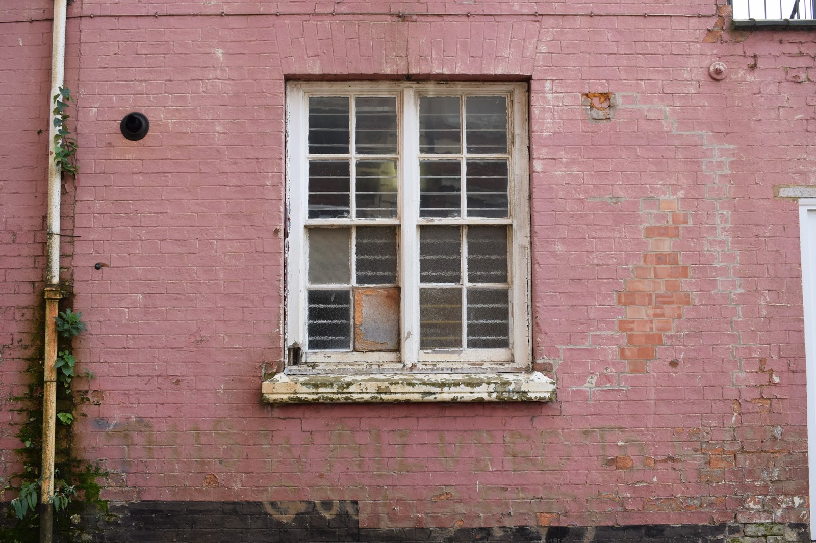
The location of the pink wall was next to a road which was a dead end, therefore, this may be a risk as many cars use this road throughout the day. Although this location was a quiet area and therefore there were not a lot of people of whom walked on the pathway where the model would be placed.
The park:
Risks consist of the location being wet and therefore become slippery. The model or the photographer may get hurt in this situation.
The location of the factory also had the risk of being in the way of other people or the danger or cars as it was a very busy road.
Brick wall:
The brick wall was in an isolated area where there was no risk of cars or other people although the only risk was that the part of the bottom of the wall that was overgrown and the model could trip or if it was wet the model would be at risk of slipping.
Factory door:
This held the risk of vans needing access through this door and the risk of the model being harmed by these cars.

The boarded up pub/club was also in the same area as that of the pink wall; therefore, there was the same risks of cars and people.

The next location of the plain black wall was in a residential car park; therefore, there was a large risk of cars injuring myself or the model during the photoshoot.
The precautions I will take concerning whether it rains on the day of the photoshoot is to change the location to an indoor alternative or arrange another time for the images to be taken. The risk of the cars will be dealt with by assessing how busy the area is and ensuring that not many cars are around; if it is busy then I will ensure the model and myself are not in the way of these cars and are in the safest position.


 This factory conveyed a rustic, abandoned theme which I believe suits the indie genre well as indie music magazines are usually reflective of the raw and independent artists of whom are consumed by the pop industry. As my music magazine is the indie-pop genre I am able to focus on either the aspects of indie or pop within each magazine edition. Therefore, by having locations such as this factory I am able to focus on the indie side of my genre within the image and then add pop conventions within the editing and incorporation of text later within my development.


 These windows provided a backdrop similar to the ones earlier at the abandoned looking factory although added more lighter, eye-catching aspects which I believe would appeal more to my target audience. Alongside the peeling paint on both the windows and the brick wall itself can be seen as stereotypical indie-pop rustic conventions. This location would work well as a contrasting colour against the black brick wall as well as the plain, deteriorating brick wall.


