Sunday, 29 January 2017

Tuesday, 24 January 2017
The effects of fonts and graphics


 Similarly, the Allura font, I believe does not match the style or conventions of an indie-pop music magazine. The handwritten style conveys an informal tone which would be more appealing to consumers as it is portrayed as more personal; although, this specific font is very neat and I believe would be more effective on a classical music magazine rather than an indie-pop magazine. A font similar to this but handwritten in a more relaxed style would convey my music magazine's genre more effectively.
 The Economica font is bold and the letters have a smaller width than the previous fonts as well as a smaller weight to each letter. I believe this font would be effective being included within my indie-pop music magazine, it is very simplistic yet appealing to potential consumers of the magazine.
The next font, Gleggo, is very similar to that of Alike, although the width is less, the contrast is less and the weight of the letters is also less.

The Julius Sans One font has a very small weight to the letters, a very low contrast but with a larger width of each letter. It is very clear and bold in some respects although for my magazine I would like the font I use to be bold enough to see from a distance so that passing potential customers eye's are caught by the bold font and then they will buy the magazine.

These graphics below are those I wish to include within my music magazine; the diamond shape graphic is very effective in the different styles I can create with my colour scheme on my front cover whilst not being too bold or invasive, this is a similar convention of the two of the three at the bottom as the last graphic, the one that is block black, is too invasive as it would cover some of the main image. therefore, I believe I will be using the top graphic and maybe one of the two that are less bold than the third.


Monday, 23 January 2017


Sunday, 8 January 2017


Friday, 23 December 2016
Risk Assessment
I have carried out a risk assessment of the locations where I will be taking my images for my music magazine.

The location of the pink wall was next to a road which was a dead end, therefore, this may be a risk as many cars use this road throughout the day. Although this location was a quiet area and therefore there were not a lot of people of whom walked on the pathway where the model would be placed.
 The park:
Risks consist of the location being wet and therefore become slippery. The model or the photographer may get hurt in this situation.

The location of the factory also had the risk of being in the way of other people or the danger or cars as it was a very busy road.
 Brick wall:
The brick wall was in an isolated area where there was no risk of cars or other people although the only risk was that the part of the bottom of the wall that was overgrown and the model could trip or if it was wet the model would be at risk of slipping.

Factory door:
This held the risk of vans needing access through this door and the risk of the model being harmed by these cars.

The boarded up pub/club was also in the same area as that of the pink wall; therefore, there was the same risks of cars and people.

The next location of the plain black wall was in a residential car park; therefore, there was a large risk of cars injuring myself or the model during the photoshoot.
The precautions I will take concerning whether it rains on the day of the photoshoot is to change the location to an indoor alternative or arrange another time for the images to be taken. The risk of the cars will be dealt with by assessing how busy the area is and ensuring that not many cars are around; if it is busy then I will ensure the model and myself are not in the way of these cars and are in the safest position.
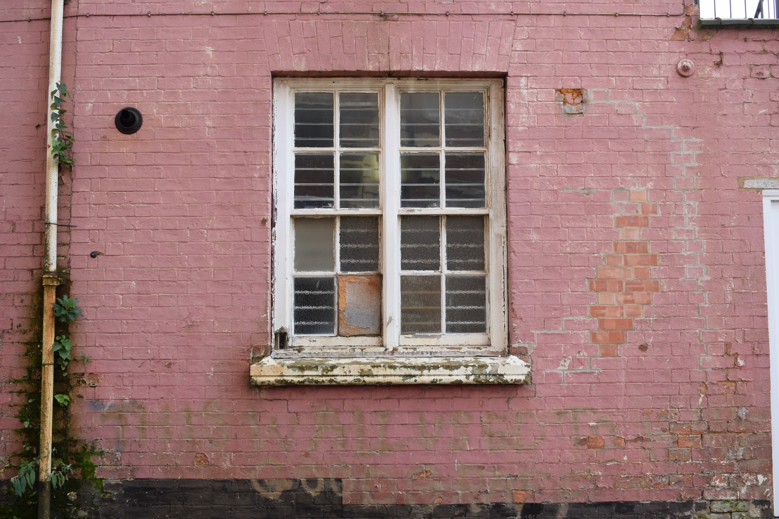
The location of the pink wall was next to a road which was a dead end, therefore, this may be a risk as many cars use this road throughout the day. Although this location was a quiet area and therefore there were not a lot of people of whom walked on the pathway where the model would be placed.

Risks consist of the location being wet and therefore become slippery. The model or the photographer may get hurt in this situation.

The location of the factory also had the risk of being in the way of other people or the danger or cars as it was a very busy road.

The brick wall was in an isolated area where there was no risk of cars or other people although the only risk was that the part of the bottom of the wall that was overgrown and the model could trip or if it was wet the model would be at risk of slipping.

Factory door:
This held the risk of vans needing access through this door and the risk of the model being harmed by these cars.

The boarded up pub/club was also in the same area as that of the pink wall; therefore, there was the same risks of cars and people.

The next location of the plain black wall was in a residential car park; therefore, there was a large risk of cars injuring myself or the model during the photoshoot.
The precautions I will take concerning whether it rains on the day of the photoshoot is to change the location to an indoor alternative or arrange another time for the images to be taken. The risk of the cars will be dealt with by assessing how busy the area is and ensuring that not many cars are around; if it is busy then I will ensure the model and myself are not in the way of these cars and are in the safest position.
Tuesday, 20 December 2016
Original Images Analysis
The first few images were taken within a local park, I
choose this location and had my model stand in the middle of the pathway to
introduce symmetry into my images. The model is holding a guitar to convey that
it is a music magazine and to further convey that they are an artist.
In the first four images on the left the model is looking at the guitar and moving naturally between images as if she is playing the instrument. The first three images are mid-close up images, by doing this there is still obvious symmetry, you can see the model clearly and there is not a lot of focus on the busy background as the location was in the middle of a built up area.
Within other images I zoomed out from the mid-close up to
create a wide shot to emphasise the symmetry of the trees and the amount of
space around the model/artist. I then continued to use this wide-shot angle/frame as I
wanted to take a variety of shots and by having some images more zoomed out I
have the choice to crop the image to fit the magazine whilst editing my chosen
images.In the first four images on the left the model is looking at the guitar and moving naturally between images as if she is playing the instrument. The first three images are mid-close up images, by doing this there is still obvious symmetry, you can see the model clearly and there is not a lot of focus on the busy background as the location was in the middle of a built up area.
In other images, the model/artist turns her head more towards the camera
although there is not direct address from the model within these images. I took
these as action shots to imply within my magazine the natural state of these
artists performing or busking as they may have before they succeeded in their
career. Therefore, this further places emphasis on my indie-pop genre as music
related to this genre are quite acoustic and in a way by taking images in a
natural setting, along with the guitar and everyday clothing I am able to
convey my artists like the genre, back to basics and raw.
I then changed my technique by taking the picture portrait
to further provide myself with a variety of images to ensure I have an
alternative set of images in case one of the previous landscape images cannot
be edited to fit my magazine's design. Although, within this portrait images
the model/artist does begin to create direct eye-contact which therefore
establishes a direct mode of address and personal connection with the
readers/audience. I then took my images so they were landscape again; although
I zoomed in a bit more to get a mid close-up shot where the artist/model is
making direct eye contact. At this point within the photo shoot the model changed the
position of her head and angles it more upwards and clearly shows her face
along with direct eye contact.
I then changed to my next location; the park bench is
representative of the artists relaxed, raw music style as it is very simplistic
and can be described as a natural image as the artist is implied to have
started off busking in her local areas and performing in the local bars etc.
I then changed the shot by zooming out to the long-mid shot so that this yellow, fallen post that conveys a rustic, abandoned tone to the images which is common within indie-style images.
After taking more images on the bench with close-up shots of the model/artist I then changed my location to a tree within the park; to place more emphasis on the season of autumn I attempted to include more leaves into the images although in my original image post you can see that these images were not successful and therefore I decided to have the model sit on the floor and have the model as the main focus although obvious use in the background of the autumn leaves. I then used a variety of shots within this setting of mid-shots and close-ups to create a wider variety.
The next location I used the similar techniques of using a wide range of shots against a black wall; the black wall gave my images a very simplistic look and therefore placed all the focus onto the artist/model.
There is very similar reasoning for the next four locations as they were all quite simplistic and were not very busy background and therefore would place further emphasis on the model.
I then changed the shot by zooming out to the long-mid shot so that this yellow, fallen post that conveys a rustic, abandoned tone to the images which is common within indie-style images.
After taking more images on the bench with close-up shots of the model/artist I then changed my location to a tree within the park; to place more emphasis on the season of autumn I attempted to include more leaves into the images although in my original image post you can see that these images were not successful and therefore I decided to have the model sit on the floor and have the model as the main focus although obvious use in the background of the autumn leaves. I then used a variety of shots within this setting of mid-shots and close-ups to create a wider variety.
The next location I used the similar techniques of using a wide range of shots against a black wall; the black wall gave my images a very simplistic look and therefore placed all the focus onto the artist/model.
There is very similar reasoning for the next four locations as they were all quite simplistic and were not very busy background and therefore would place further emphasis on the model.
Subscribe to:
Posts (Atom)